

Funny how cool and shitty that theme looks at the same time.
Like, with that amount of pixels a modern readable theme is totally possible.
Or… marble XD
Love KDE
Edit: ok looking at it closely, that theme is completely lit!
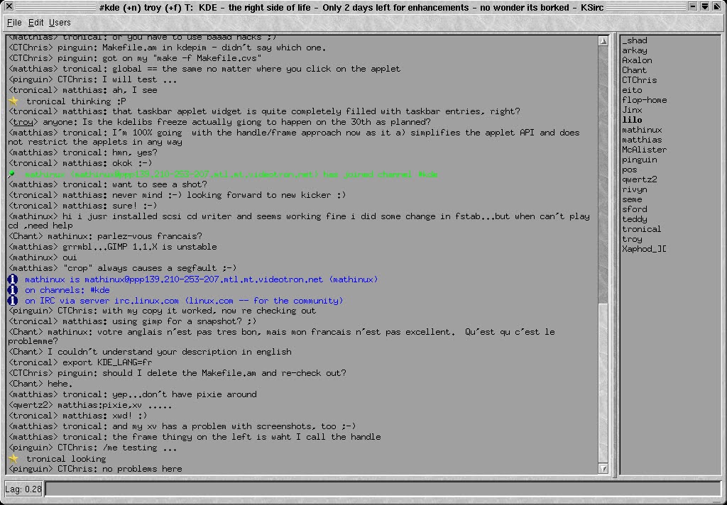
A product of its time. KDE 2 released in 2000 and this is a pre-release screenshot of a non-default theme. The default KDE 2 theme looked like this. It was competing with the likes of Windows Me, Mac OS 9 and GNOME 1.
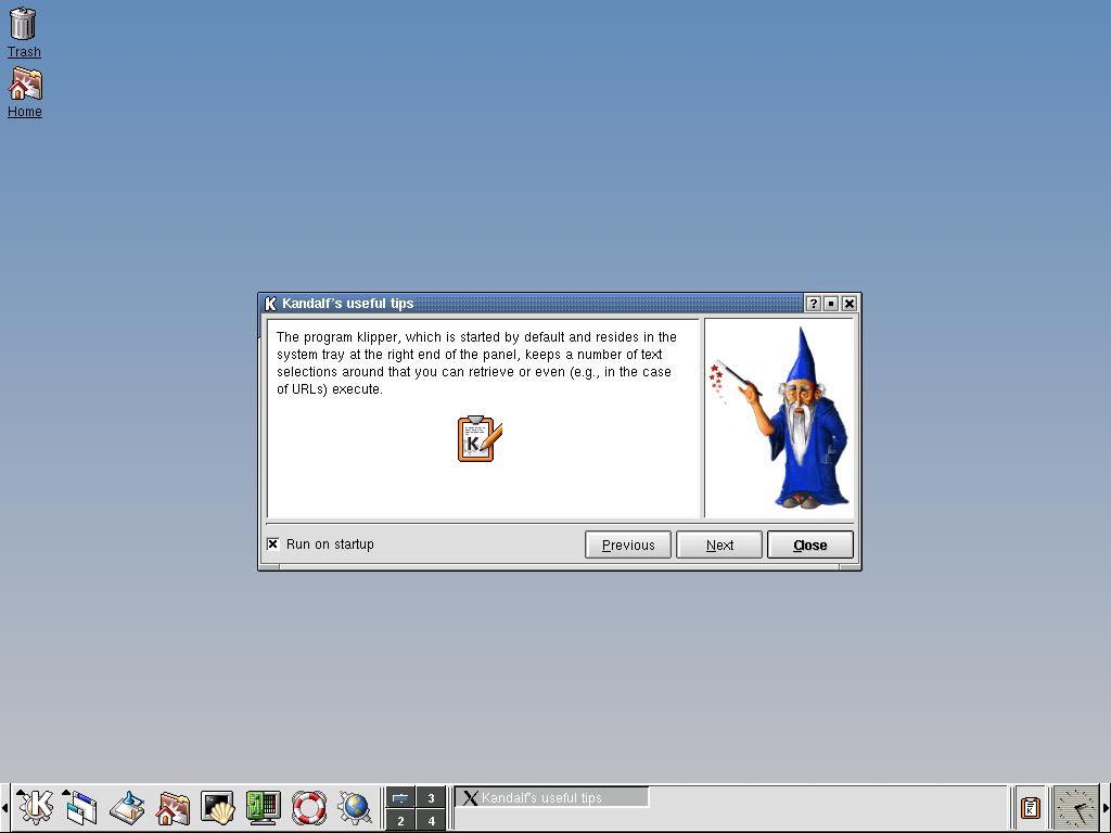
Kandalf XD damn, very interesting links
Amazing, thanks for sharing these!
Looks awesome to me. Even better than what we have these days.
Looks like Motif with its trademark terrible contrast (black text on dark grey, very accessible) and a lame marble texture slapped on top of it. Also that button in the bottom left corner has like zero margins. Very 2000 overall. Not something I’d ever want to use, tho. To be fair, the default theme KDE 2 ended up using was significantly better.


