I don’t like fonts where the glyphs look wider than they are tall? In my head I call them ‘fat fonts’. IIRC Source Code Pro is like that? I used FiraCode for the longest time but recently migrated to Victor Mono. The Italics haven’t warmed on me but the rest of the faces including the Obliques look great.

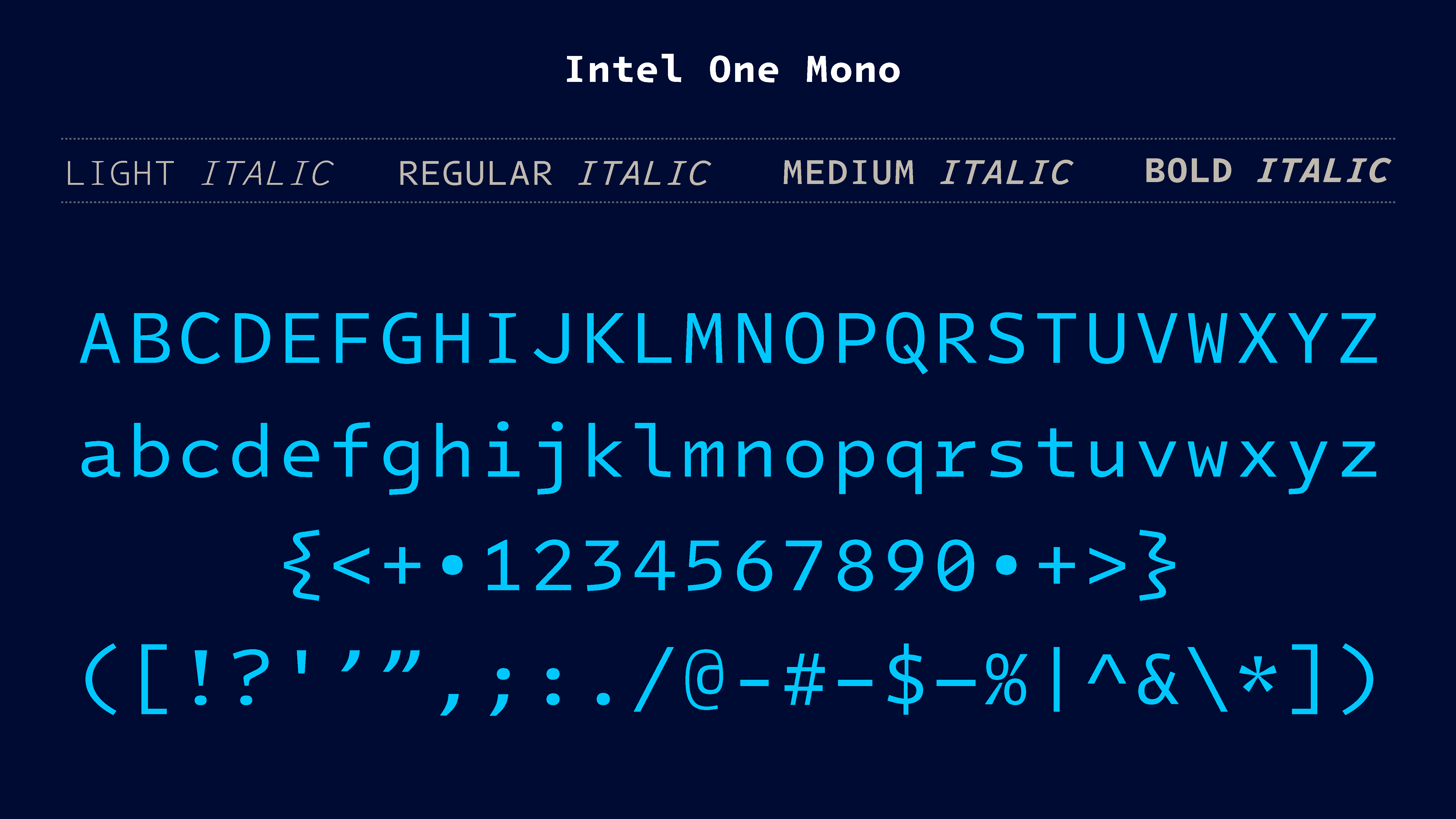
I don’t like fonts where the glyphs look wider than they are tall? In my head I call them ‘fat fonts’. IIRC Source Code Pro is like that? I used FiraCode for the longest time but recently migrated to Victor Mono. The Italics haven’t warmed on me but the rest of the faces including the Obliques look great.
I have a feeling you’ll enjoy Iosevka then.
The second time I heard about Victor Mono today. I might download it today.