

26·
17 days agoReminds me of an interaction I had a long time ago.
    Me: :[
Friend: Turn that frown upside down!
    Me: ]:
Reminds me of an interaction I had a long time ago.
Me: :[
Friend: Turn that frown upside down!
Me: ]:

HFY = Humanity Fuck Yeah! A place for writers to post their stories about humans being awesome. Many of them were sci-fi space operas which is what I loved.

Oh neat, didn’t know it had this feature, thanks!
I love you, thanks! Had no idea this was already integrated into the keyboard already.
Hang on, how do you use emoji kitchen with Gboard?
I’ll bite the bait and ask you to explain how Starlink satellites contribute towards the space junk problem without having to reference astronomy or bringing up you-know-who’s name.

I have mine configured like this to mimic the RIF layout
What’s called sweet tea in the US is overwhelmingly sweet. That was my reaction to it the first time I tried it. It’s so sweet, the only way you can get that much sugar in it is if you dissolve that sugar in hot tea.
As far as we’re aware, dark matter only interacts with the universe gravitationally. It doesn’t even interact with itself, which is why we don’t see dark planets/stars/galaxies popping into existence. It only follows normal matter around.
As for why it’s not called cold, is for two reasons:
If it happened to be clouds of gas and dust that overall had a net gravitational effect on the background galaxies, we’d be able to detect the spectral lines of these clouds. Same for just about all the other objects in that list. In some cases we do detect intergalactic gas clouds. But in places where there’s very clearly unaccounted for gravitational lensing, there isn’t any sign of this. So far the only things we can match up to the observations is a mathematical model of the stuff.

From a technical standpoint, I can’t see media-heavy social media in the format of Facebook lasting too long in a federated environment considering the costs involved to maintain the server instance. Trying to do that while being free is absolutely unsustainable. Another shift in resource management would have to happen before platforms like that would be inexpensive and scalable.
Currently, Lemmy instances are slowly and steadily growing with each user interaction within, and between instances. Most shared content is link aggregation meaning minimal server resources. But resource usage goes up much faster when images, or even videos are uploaded to be shared. This format will only grow more expensive over time, and definitely won’t last in the current format.
Ah, updated Connect and can confirm it behaves normally, sorry about that! (Thought it had already updated)
Still loving all the updates and thanks for the amazing work!
It’s not really a bug, just wonky behavior. When viewing a large image that requires zooming, moving around in the image seems to make connect close the image. So I end up trying to view the image several times, or get frustrated enough to download the image just to view it 🥲
Oh hey you added in the comment stuff! It’s great for an initial release, though it definitely does need some refinement to be easily useable.
Thanks for being so responsive! I tried out that setting just now and it’s not quite what I mean in terms of UX. To preface: I’m not trying to make your app a clone of RIF which I heavily used, and your app does feel the most similar to that for me so do what you will with my feedback.
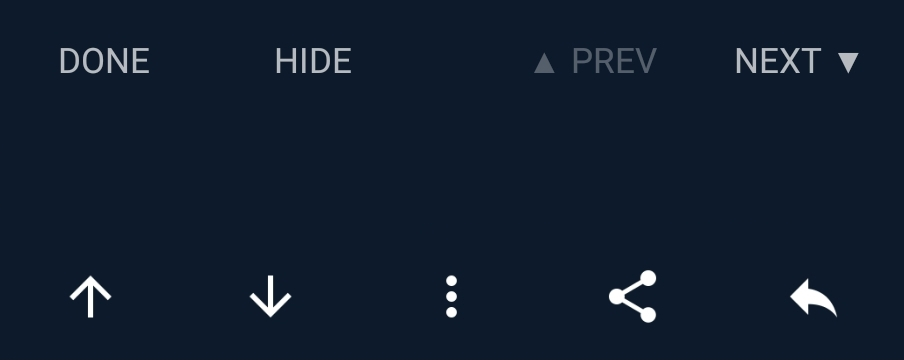
My main issue with the way Connect currently behaves is if I wanted to collapse the first few comments after returning to a post, I’d have to either toggle the setting to tap each comment to hide them all, before toggling it again so that I can interact with the comments normally, such as voting, bookmarking, sharing, etc. Whereas, if the options were available all at once when tapping on a comment, I can do everything in two taps, versus one or the other, with two taps, or waiting for a long tap to process.
As stated previously, I know screen real estate is at a premium for some devices, so cramming more buttons below each comment is not necessarily ideal. But what RIF did well, was including these features all at once to the user when the comment was tapped, by displaying extra action buttons above the selected post, in addition to the normal interaction buttons below the post. See the screenshot attached below:
Edit: To add to this, after rereading that post, I’d like to make the distinction that I mean collapse a comment, everywhere I say the word hide. As there are many times I’d like to reread comments if new replies are posted below them, and I’ve yet to figure out how to unhide comments after testing the hide feature out.
Edit 2: Also just noticed a bug. Viewing the community info displays Subscribe for all instances, regardless of actual subscription state.
Loving the updates so far!
Small request though: Toggleable setting that adds a hide/show button to each comment so that we can immediately hide a post instead of waiting for the long press to trigger. I know screen real estate is at a premium for most phones, which is why this would be a Toggleable setting.
Another silly bug: When the confirmation dialog to exit the application appears, tapping yes does nothing.
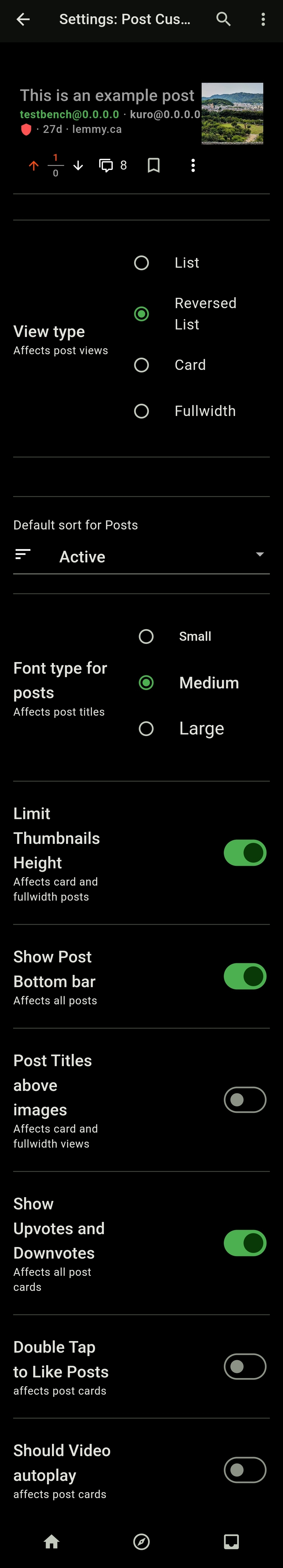
Hey! Looks like disabling the post titles above images setting fixed it for me.


$4 Sausage $4 Eggs $4 Bacon $2 Toast $1 OJ
The price seems very high for each ingredient but it sounds great as a breakfast